"Refraction of Sun Through a Glass"in this piece, I aimed to capture the way light dances through different textures and shapes on a transparent surface. in creating this piece I challenged myself to exercise smooth blending from color to color on some elements, alongside smooth line work that would make it easier to differentiate between similarly colored elements in the piece. in addition to this, I wanted to challenge myself to mix a variety of consistently opaque values and colors using only primary acrylic paints. |
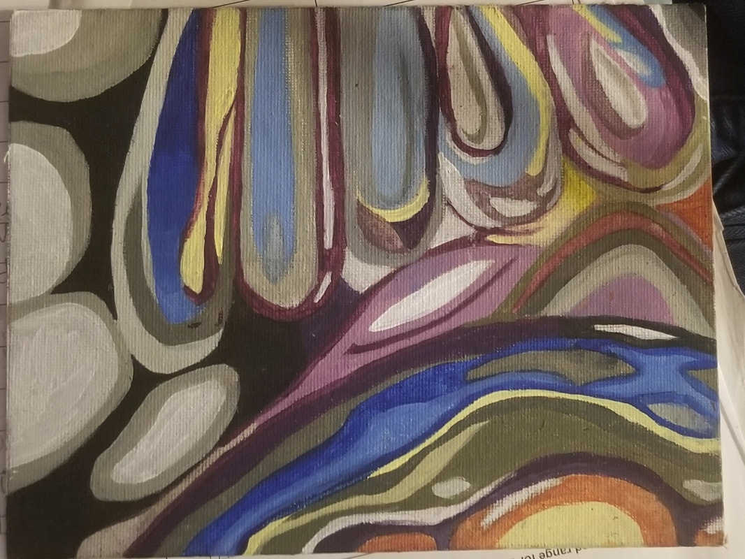
title: "Refraction of Sun Through a Glass"
size : 9 in. x 7 in. medium: acrylic paint (Walmart), primed painting board (Mr. Chad) date of creation: September 21st, 2023 |
Process:
I began the creation of this piece by measuring the proportions of my canvas. I found that my canvas was nine inches by seven inches, one side of the piece being two inches larger than the other. the easiest equivalent to this I could think of was 1 in by 3 inches, so I penciled out a rectangle on my inspiration photo that had these measurements. I chose to recreate the portion of the photo I did because I was very excited by the repetition of scalloped shapes near the top of the piece. in addition to this I was very intrigued by the amount of colors I was able to differentiate in such a small subsection of a photo. the contrast between the varying values of white, grey, and black against the concentrated pops of color found in the image were very striking and I believed that I could meet my goal of mixing varied colors and values using limited shades of paint in recreating this section of my inspiration photo. I divided my subsection into 8 even portions, and I did the same on my primed board. after this I began penciling in every a simple outline of every small detail found on the photo I chose to recreate onto my canvas. once this was done I plotted out outlines of every highlight, shadow, minor differentiation in color or value, and gradation between colors onto my piece. when this was done I began plotting out the colors of every single detail I penciled down. I did this by mixing small amounts of paint with water to create transparent washes in order to see my original outlines underneath my color work, so that permanent mistakes would not be made. after completing this wash I went in later with straight acrylic paint to finalize every detail of color and value that I previously laid down. I used a pale gray as a highlight color to emphasize the speckles of light found in the background areas surrounding the etched glass pictured in my piece. I also used a pale gray around the black edge on my first scallop shape. I used a near black gray as the main color on the areas surrounding the etched glass pictured in my piece in order to contrast the pops of color in the etching. this contrast brings emphasis to the etching depicted in my piece. I also used this color on the edge of my first scallop. I used a mid tone gray as a transition color between the pale gray accent speckles and the near black background, in addition to using it around the highlights on the etchings. I used a navy blue color on the upper middle of my first scallop, in addition to using it on the center edge of the second scallop, as well as around the uppermost highlight in the center of the last scallop. I used a robins egg blue in the lower middle of my first scallop, in the middle of my second scallop, in the inner, non highlighted edge my first scallop, and in the middle of and blue highlight on my last scallop. I used a blue grey on the middle of my third scallop, the edge and highlight portion on my second scallop, and I mixed it with the near black to paint the inner edge of my third scallop. I used a pure yellow as an accent color in the background of my piece, in addition to using it on the edge of my first scallop. I used a muddled yellow color on some parts of my first ring on the bottom of the cup pictured in my reference image. I also used on the upper portion of the shadow in the background underneath the last scallop. I used a red purple around the yellow portion of the first scallop, as well as on the outer edge of the second scallop, in addition to using it on the left of the first edge on the third scallop, and on the shading on the reflection above the bottom of the cup. I used a blue purple on the edge of the ring around the bubbles on the bottom of the cup, as well as on the outer edge of the bottom of the cup, the left inner edge on the bottom of the third scallop, and the right inner edge of the fourth scallop. I used a light purple as a base for the reflection above the bottom of the cup, as well as on the middle of the spike of light above the bottom of the cup, and the inner edge of the last scallop. I used a neutral, muddle color on the outer edge of the yellow portion of the bottom of the cup. finally, I used an orange color on the edge of the bubbles on the bottom of the cup to add shading, as well as using them as an accent in the middle right edge of my piece.
I began the creation of this piece by measuring the proportions of my canvas. I found that my canvas was nine inches by seven inches, one side of the piece being two inches larger than the other. the easiest equivalent to this I could think of was 1 in by 3 inches, so I penciled out a rectangle on my inspiration photo that had these measurements. I chose to recreate the portion of the photo I did because I was very excited by the repetition of scalloped shapes near the top of the piece. in addition to this I was very intrigued by the amount of colors I was able to differentiate in such a small subsection of a photo. the contrast between the varying values of white, grey, and black against the concentrated pops of color found in the image were very striking and I believed that I could meet my goal of mixing varied colors and values using limited shades of paint in recreating this section of my inspiration photo. I divided my subsection into 8 even portions, and I did the same on my primed board. after this I began penciling in every a simple outline of every small detail found on the photo I chose to recreate onto my canvas. once this was done I plotted out outlines of every highlight, shadow, minor differentiation in color or value, and gradation between colors onto my piece. when this was done I began plotting out the colors of every single detail I penciled down. I did this by mixing small amounts of paint with water to create transparent washes in order to see my original outlines underneath my color work, so that permanent mistakes would not be made. after completing this wash I went in later with straight acrylic paint to finalize every detail of color and value that I previously laid down. I used a pale gray as a highlight color to emphasize the speckles of light found in the background areas surrounding the etched glass pictured in my piece. I also used a pale gray around the black edge on my first scallop shape. I used a near black gray as the main color on the areas surrounding the etched glass pictured in my piece in order to contrast the pops of color in the etching. this contrast brings emphasis to the etching depicted in my piece. I also used this color on the edge of my first scallop. I used a mid tone gray as a transition color between the pale gray accent speckles and the near black background, in addition to using it around the highlights on the etchings. I used a navy blue color on the upper middle of my first scallop, in addition to using it on the center edge of the second scallop, as well as around the uppermost highlight in the center of the last scallop. I used a robins egg blue in the lower middle of my first scallop, in the middle of my second scallop, in the inner, non highlighted edge my first scallop, and in the middle of and blue highlight on my last scallop. I used a blue grey on the middle of my third scallop, the edge and highlight portion on my second scallop, and I mixed it with the near black to paint the inner edge of my third scallop. I used a pure yellow as an accent color in the background of my piece, in addition to using it on the edge of my first scallop. I used a muddled yellow color on some parts of my first ring on the bottom of the cup pictured in my reference image. I also used on the upper portion of the shadow in the background underneath the last scallop. I used a red purple around the yellow portion of the first scallop, as well as on the outer edge of the second scallop, in addition to using it on the left of the first edge on the third scallop, and on the shading on the reflection above the bottom of the cup. I used a blue purple on the edge of the ring around the bubbles on the bottom of the cup, as well as on the outer edge of the bottom of the cup, the left inner edge on the bottom of the third scallop, and the right inner edge of the fourth scallop. I used a light purple as a base for the reflection above the bottom of the cup, as well as on the middle of the spike of light above the bottom of the cup, and the inner edge of the last scallop. I used a neutral, muddle color on the outer edge of the yellow portion of the bottom of the cup. finally, I used an orange color on the edge of the bubbles on the bottom of the cup to add shading, as well as using them as an accent in the middle right edge of my piece.


|

|


Experimentation:
I originally planned to plot out a one by three inch subsection of a picture depicting a marble with wisps of color on the interior in my piece. I planned to divide this subsection into five even portions. I found that it would be extremely difficult to divide my nine by seven inch canvas into ten even subsections, so I wound up randomly dividing my board with crooked lines at estimated distances from one another. furthermore, in penciling down the details of my chosen section onto my board, I found that the concentration of lines so close to one another made it difficult for me to differentiate between the details I plotted down for my piece, these two issues coupled with one another led me to choose a different, subsection with the same proportions as the original from a different picture and divide it into eight even subsections. I drew a horizontal line down the middle of my piece, and then I drew a vertical line through the middle of the aforementioned line. I drew two more vertical lines down the middle of each side of the initial vertical line drawn. after this I penciled in every detail and change in color I noticed in my piece, and found that there was just as much variation of color in the second subsection I chose as the first one, with less preliminary line work necessary to plot out my piece. after experimenting with the layout of my piece, I went into plotting out the colors I would use in the final draft of my work. I went from left to right in plotting out the colors for the details in the first row of rectangles in my piece. this method of plotting out color proved to be extremely tedious and time consuming. every class period I had to keep mixing up loads upon loads of colors leaving me nearly thirty minutes to complete each square respectively. this made it so that I could only finish about one square every class. plotting out my piece and and the colors within the first row of rectangles took up one whole week of the two weeks I had to complete this piece. this left me with only one week to wash the bottom row of rectangles and finish the entire final coat for the piece. in washing the second row of rectangles I chose to plot out each detail color by color, which ensured that I only had to mix each color once, leaving me more time to actually paint. in washing some portions of my piece, the amount of water in my water to paint to water ratio was too high, leaving it so that some parts of my wash dried to be almost invisible. this made it incredibly difficult to differentiate between several major details in my piece, leaving the preliminary wash to look muddled. to fix this I increased the amount of paint utilized in my water to paint ratio. I went over the muddled looking parts with this adjusted wash mixture, which made it so that I could have a sharper guide to go about painting the final coat of my piece.
I originally planned to plot out a one by three inch subsection of a picture depicting a marble with wisps of color on the interior in my piece. I planned to divide this subsection into five even portions. I found that it would be extremely difficult to divide my nine by seven inch canvas into ten even subsections, so I wound up randomly dividing my board with crooked lines at estimated distances from one another. furthermore, in penciling down the details of my chosen section onto my board, I found that the concentration of lines so close to one another made it difficult for me to differentiate between the details I plotted down for my piece, these two issues coupled with one another led me to choose a different, subsection with the same proportions as the original from a different picture and divide it into eight even subsections. I drew a horizontal line down the middle of my piece, and then I drew a vertical line through the middle of the aforementioned line. I drew two more vertical lines down the middle of each side of the initial vertical line drawn. after this I penciled in every detail and change in color I noticed in my piece, and found that there was just as much variation of color in the second subsection I chose as the first one, with less preliminary line work necessary to plot out my piece. after experimenting with the layout of my piece, I went into plotting out the colors I would use in the final draft of my work. I went from left to right in plotting out the colors for the details in the first row of rectangles in my piece. this method of plotting out color proved to be extremely tedious and time consuming. every class period I had to keep mixing up loads upon loads of colors leaving me nearly thirty minutes to complete each square respectively. this made it so that I could only finish about one square every class. plotting out my piece and and the colors within the first row of rectangles took up one whole week of the two weeks I had to complete this piece. this left me with only one week to wash the bottom row of rectangles and finish the entire final coat for the piece. in washing the second row of rectangles I chose to plot out each detail color by color, which ensured that I only had to mix each color once, leaving me more time to actually paint. in washing some portions of my piece, the amount of water in my water to paint to water ratio was too high, leaving it so that some parts of my wash dried to be almost invisible. this made it incredibly difficult to differentiate between several major details in my piece, leaving the preliminary wash to look muddled. to fix this I increased the amount of paint utilized in my water to paint ratio. I went over the muddled looking parts with this adjusted wash mixture, which made it so that I could have a sharper guide to go about painting the final coat of my piece.

|

|

|

|

|

Reflection:
in creating this piece I bettered my ability to create a variety of shades using only black, white, yellow, red, and blue acrylic paint. this skill will save me money in the future, as I will not have to buy small tubes of specialized colors every time I start a piece as I see some of my classmates doing in the future. I also bettered my ability to create smooth clean edges when painting in acrylic, as the majority of the pieces I have painted in acrylic have been heavily reliant on even gradients between colors, or laying down choppy dots to create impressionist inspired pieces. I also developed the skill of translating a small image onto a larger scale canvas, as the majority of reference photos I have used in the past have been the same size as the canvases I painted them on. I did not have any particular inspiration for this project, which I found to be a helpful guide as it forced me to focus more on the techniques used to create my piece rather than taking creative liberty to make abstracted representations of references to convey emotion, the subject matter I usually explore. the biggest challenge I encountered in creating this project was managing the amount of time I spent on the earliest stages of the piece, as in lower levels of art class I was given about a month to create a piece from start to finish, while I was only given about two weeks to finish this one. I will be able to use the knowledge regarding time management I learned from this project to go about creating future projects in this course. I hope my audience are as awestruck by the bold colors and contrasts in my piece as I was upon initially looking at the reference photo for this piece.
in creating this piece I bettered my ability to create a variety of shades using only black, white, yellow, red, and blue acrylic paint. this skill will save me money in the future, as I will not have to buy small tubes of specialized colors every time I start a piece as I see some of my classmates doing in the future. I also bettered my ability to create smooth clean edges when painting in acrylic, as the majority of the pieces I have painted in acrylic have been heavily reliant on even gradients between colors, or laying down choppy dots to create impressionist inspired pieces. I also developed the skill of translating a small image onto a larger scale canvas, as the majority of reference photos I have used in the past have been the same size as the canvases I painted them on. I did not have any particular inspiration for this project, which I found to be a helpful guide as it forced me to focus more on the techniques used to create my piece rather than taking creative liberty to make abstracted representations of references to convey emotion, the subject matter I usually explore. the biggest challenge I encountered in creating this project was managing the amount of time I spent on the earliest stages of the piece, as in lower levels of art class I was given about a month to create a piece from start to finish, while I was only given about two weeks to finish this one. I will be able to use the knowledge regarding time management I learned from this project to go about creating future projects in this course. I hope my audience are as awestruck by the bold colors and contrasts in my piece as I was upon initially looking at the reference photo for this piece.
